|
By accessing/using The Crittenden Automotive Library/CarsAndRacingStuff.com, you signify your agreement with the Terms of Use on our Legal Information page. Our Privacy Policy is also available there. |

How Toyota made me think the Auris was bland (when in fact it isn't)
|
|---|
|
|
How Toyota made me think the Auris was bland (when in fact it isn't)
Matt Hubbard
Speedmonkey
January 6, 2013
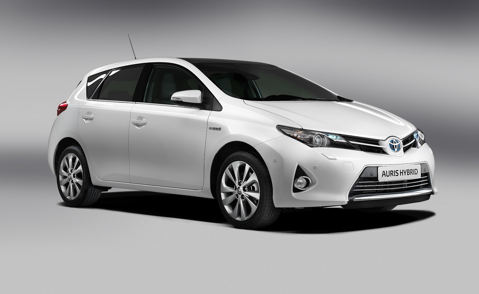
When Toyota launched the new Auris I was pretty scathing about it. Have a look at the picture below. It's just nothing. In fact I was so horrible about it
I wrote an article inviting people to guess what it was with the logos covered up. Out of fifteen replies two were correct - of those one was a journalist and the other works for Toyota.
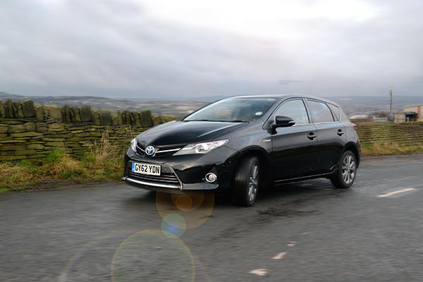
But then, a revelation. A photographer showed me a photo taken on a damp road in low sunlight of a black Auris. It was as if the prejudice inside me fell away to be replaced with a feeling that the Auris is actually quite a handsome car. Well, the front end and the front part of the flanks are, but the rear end still needs tidying up. Here's the photo in question (Image by kind permission of CAP Automotive).
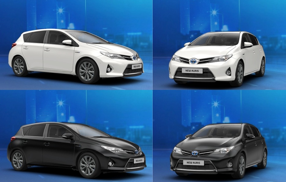
So I had a play with the Auris configurator on the Toyota website. And you know what? The same holds true there too. Have a look below for the results. It's as if the white car removes any personality. It blandifies what lines there are and smoothes out any character. The black, on the other hand, adds a layer of character and accentuates the lines and personality that are there. But that is erased on the white car.
The black paint allows us to see the car not altogether as it is but as the light reflects off it. Car designers spend many hours creating lines, shapes and creases in order to make a car more visually stimulating and individual in terms of the interplay of light with the bodywork. And then the manufacturer paints it white, which gobbles up all the reflections and hides all the designers work.
This is where Toyota made a mistake. In the original imagery of the new Auris, released back in September, it showed two cars. One in blue and one in white. The first image I saw was the white one, the first image in this article. That set in me my deep rooted prejudice against the Auris - that it was a white good, or 'Novocain for the eyes' as I called it. Any Auris I've seen since, in the metal has completely failed to change my opinion purely because I've not looked at it for any length of time - due to that image derived from that photo of that white car.
And it took the image of the black car to yank that preconceived idea from my mind. I won't be the only person put off the new Auris by that initial photo. Maybe you were. Maybe you have changed your mind by seeing it in a different light.
Car manufacturers put out publicity photos when they release a new, or revised, car. They sometimes make mistakes. The Mercedes-Benz SLS AMG Black Edition looked horrible in the yellow we saw in the first shots, but sensational in the shots of the white car that were initially sent to the American market. The SLS AMG looks good in white because of the contrasting carbon and because it's shape is so strong. The Auris's rounder, less dynamic, shape doesn't lend itself to the same colour.
Bentley have recently released images of the
Continental GT Speed Convertible in a horrible shade of pink. I asked them why to which they replied that they, "...wanted to try something different."
Designing and launching a new car costs millions, or even billions, of pounds, euros, yen or dollars. Manufacturers can then make the simple mistake of presenting it in the wrong colour, which may cost them in terms of sales, and ultimately profit.
Toyota made a mistake with that white Auris. I hope they don't make the same mistake again, although they probably will.