|
By accessing or using The Crittenden Automotive Library™/CarsAndRacingStuff.com, you signify your agreement with the Terms of Use on our Legal Information page. Our Privacy Policy is also available there. |

Volvo Concept Estate - Images And Details
|
|---|
|
|
Volvo Concept Estate - Images And Details
Matt Hubbard
Speedmonkey
February 26, 2014
This is the Volvo Concept Estate, the final part in the current Volvo concept trilogy
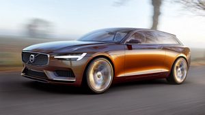
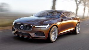
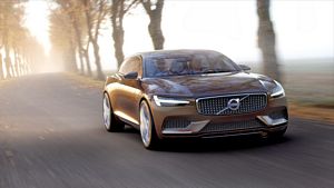
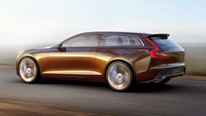
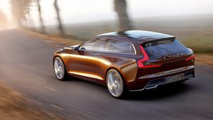
Following on from the XC Coupe concept and Concept Coupe Volvo has revealed its latest, the Volvo Concept Estate. And it looks damn good.
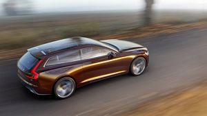
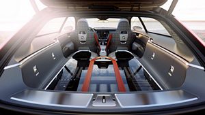
The front end and grille are similar to the previous concepts, as are the signature LED rear lights. The Concept Estate takes inspiration from the 1800 ES shooting brake from the early 1970s so it's a three door with a hatch boot - although that high floor looks rather impractical.
As an aesthetic exercise the Concept Estate looks stunning. The wheels are 21 inch and don't look huge so it's quite a large car. There's no detail on the power or drive train but it would be a crying shame if a future Volvo resembling this concept wasn't at least four wheel drive, if not rear wheel drive. With its muscular haunches and shooting brake lines front wheel drive would seem out of place.
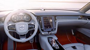
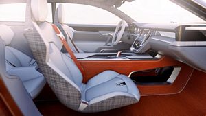
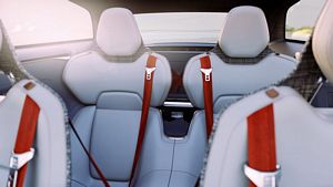
The interior is exquisitely executed. The overall design and colour scheme is meant to evoke a Scandinavian living room. I've no idea what that looks like (must ask Gothenburg resident @BuddaPSL) but the colours and materials do look very cool, particularly the orange seat belts and wood.
The big deal for Volvo is the four layer info screen. Having driven many and varied cars with many and varied screens this does seem a great solution to what is something of a problem shared by almost all current systems - that of important functionality embedded beneath layers of menus.
The Volvo system is simple. Take one screen, make it large and stack the most important controls. From the top these are navigation, media, phone and climate controls. The function being used expands whilst the others shrink. It might seem gimmicky but until you've tried a few manufacturer's cack-handed attempts at 21st century screens you'll realise it's a good idea.
Let's hope a new Volvo estate at least similar the Concept Estate will see the light of day in the next few years. Even if it doesn't the design, both external and internal, and tech point to Volvo's breaking away even further from it's safe but boxy background.
If you want to see the Volvo Concept Estate in the flesh it'll be on display at the Geneva Motor Show.


